
Widgets & Customization
Beneath the KPI row, the dashboard surfaces three working widgets — Priority Actions, Anomaly Alerts, and Performance Trends. This page explains what each widget shows, how it's generated, and how the date range picker affects them.
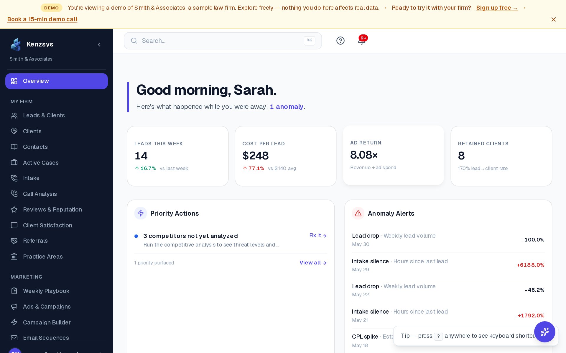
Priority Actions widget
The Priority Actions This Week card lists 3 to 6 ranked tasks the AI thinks you should tackle first. Each row contains a task description, a category tag (Ads, Reviews, SEO, Intake), and an estimated impact score.
How tasks are ranked: the AI looks at three signals:
- Recent anomalies — anything flagged in the last 7 days that hasn't been resolved.
- Missed opportunities — unanswered reviews, untagged campaigns, expired ad creative, intake calls without follow-up.
- Historical impact — actions that produced measurable lift the last time a similar firm took them.
To mark an action complete, click the checkbox to the left of the task. Completed tasks fade out and drop to the bottom of the list. To open the related page, click View on the right side of the row. The list regenerates every Monday at 9 AM, but completed actions persist across regenerations.
Anomaly Alerts widget
The Anomaly Alerts card sits next to Priority Actions and shows unusual movement in your KPIs. Common triggers include:
- Lead volume drops more than 25% week-over-week.
- Cost Per Lead spikes more than 30% versus the 4-week average.
- 48+ hours pass with no new leads (intake silence).
- Ad spend on a campaign jumps without a matching jump in conversions.
- Google Business Profile reviews drop below 4 stars on average.
Each alert shows severity (info, warning, critical), the affected metric, the deviation, and a short explanation. Click Dismiss to clear an alert from view, or Investigate to jump to the underlying data. Configure sensitivity in Settings > Notifications > Anomaly Sensitivity (Low, Medium, or High).
Calibration period: Anomaly detection requires at least 7 days of data per metric to establish a baseline. For brand-new accounts, this widget stays empty for the first week — that is expected behavior, not an error.
Performance Trends chart
The Performance Trends chart at the bottom of the dashboard plots daily lead counts broken down by channel as a stacked area chart. Channels shown by default are Google Ads, Organic Search, Google Business Profile, Direct, Referral, and Paid Social. Click any channel name in the legend to hide or show it. Hover over any day to see exact counts per channel.
The chart uses the same date range as the rest of the dashboard. If you've selected "Last 30 days," the chart shows 30 days. For longer trend views, use the date range picker to choose "Last Quarter" or a custom range.
How the date range picker affects widgets
The date range picker in the top-right of the dashboard controls almost every widget on the page. Changing it updates:
- All four KPI cards and their period-over-period comparisons.
- The Performance Trends chart.
- The data feeding Anomaly Alerts (alerts are recalculated for the selected range).
Priority Actions is the one exception — it always uses the current week regardless of the date picker, because its purpose is "what should I do this week."
Tip: Use "Last 7 days" for your morning check-in and "Last 30 days" for monthly reviews. The "Last Quarter" preset is the right choice when preparing a quarterly partner meeting.