Dashboard Tour
This page is a top-to-bottom walkthrough of the home screen. Each section explains what you're looking at, what the numbers mean, and what to do when something looks off.
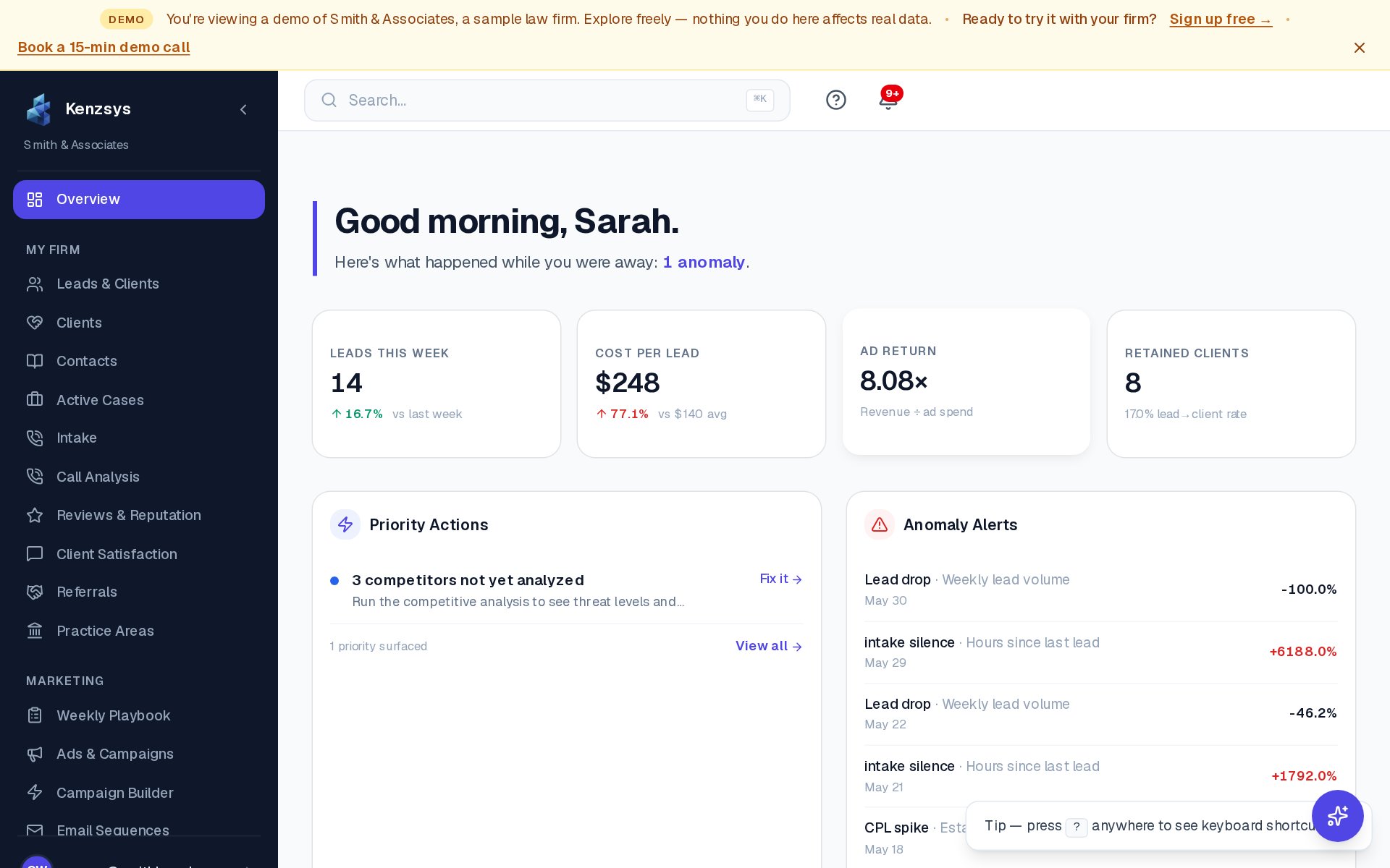
1. Greeting and date
The very top of the page shows a personalized greeting ("Good morning, Sarah") and today's date. To the right is a date range picker that controls the data shown in every card below. The default is "Last 7 days" with comparison to the prior 7 days. Clicking the picker opens a menu with presets (Last 7 days, Last 30 days, This Month, Last Month, Last Quarter) and a custom range option. Your selection is sticky — Kenzsys remembers it for your next session.
2. KPI cards row
Four headline metric cards span the width of the page. Each shows a large number, a comparison to the previous period (in green if up, red if down), and a small sparkline trend.
- Leads This Week — total inbound leads across all sources in the selected period.
- Cost Per Lead — total marketing spend divided by lead count.
- Ad Return — revenue from retained clients divided by ad spend (requires Clio + Google Ads).
- Retained Clients — leads that became matters in Clio during the period.
For details on how each is calculated, see KPIs.
3. Priority Actions card
Below the KPI row sits a card titled Priority Actions This Week. It lists 3 to 6 AI-prioritized tasks for the week — things like "Respond to 4 unanswered Google reviews" or "Pause underperforming keyword: 'free consultation lawyer'." Each row has a checkbox to mark the task complete and a View button that jumps you to the relevant page in Kenzsys. The list refreshes every Monday at 9 AM in your firm's time zone.
4. Anomaly Alerts card
Adjacent to Priority Actions is the Anomaly Alerts card. This is where Kenzsys flags unusual movement — a 40% drop in calls week-over-week, a sudden spike in CPC on a campaign, or 48 hours of intake silence. Each alert shows the metric, the deviation, and a one-sentence explanation. Click Dismiss to clear an alert from the list, or Investigate to drill into the underlying data.
Heads up: Anomaly detection needs at least 7 days of historical data to calibrate. New accounts will see this card stay empty for the first week — that's normal, not a bug.
5. Performance Trends chart
The lower half of the dashboard is a stacked-area chart titled Performance Trends. It shows daily leads broken down by source channel (Google Ads, organic search, Google Business Profile, direct, referral, paid social). Hover any day to see exact counts. Click a channel name in the legend to toggle it on or off. The chart respects the date range picker at the top of the page, so changing the range updates the chart immediately.
6. Collapsing and expanding sections
Each section heading has a small chevron icon on the right. Click it to collapse that section and free up vertical space. Click again to re-expand. Your collapsed/expanded state is saved per user, so you can pin only the cards you care about.
Refreshing data
The dashboard auto-refreshes every 5 minutes. For an immediate refresh, click the small refresh icon next to the date range picker. Data freshness depends on the integration — CallRail leads appear within seconds of a call ending, while Google Ads spend updates daily overnight.